ACCA
Refreshing the online presence of the Australian Centre For Contemporary Art with an unopinionated design style that ‘frames’ the artwork on a digital canvas.
UX/UI
THE PROBLEM
ACCA is well known for housing artwork that shocks, surprises and divides opinion amongst Melbourne residents. They needed a website that reflected the contemporary image of the gallery itself while acting as a blank canvas for the incredibly diverse work.
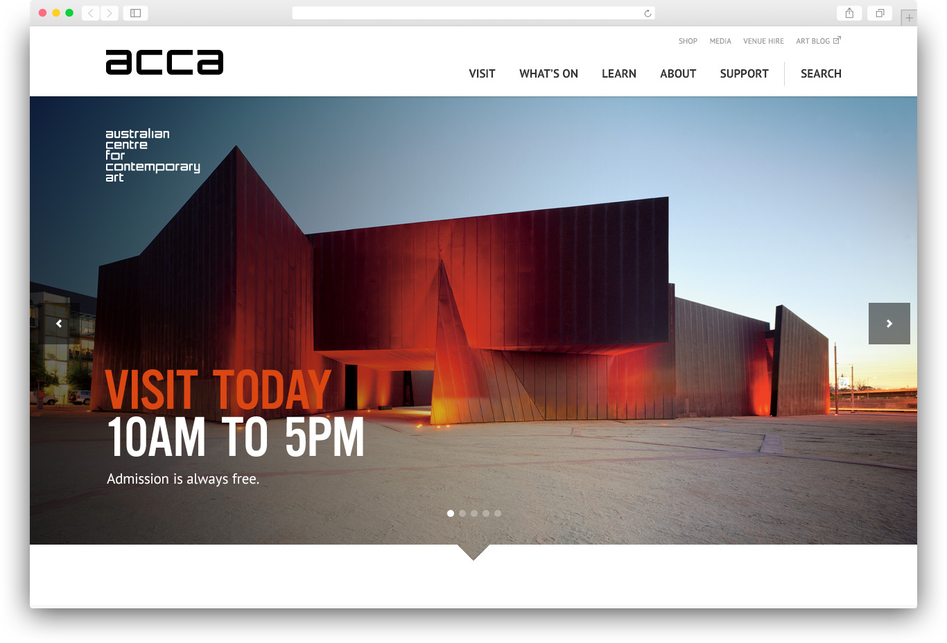
Final homepage welcomes users with an image of the iconic gallery in central Melbourne.
DISCOVERY
“I don’t know what I want… but I’ll know it when I see it”
The above statement is never what a designer wants to hear from a key stakeholder, but this was the challenge presented by the gallery’s opinionated curator. I needed to tread carefully so I began with wireframes to capture the site’s key requirements and limit feedback on aesthetic.
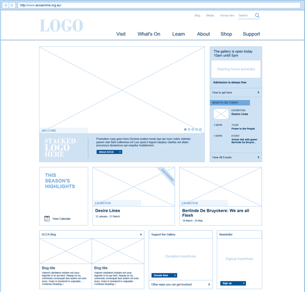
Early wireframes look very little like the final designs but were an effective means of extracting requirements.
DESIGN
10 homepages later…
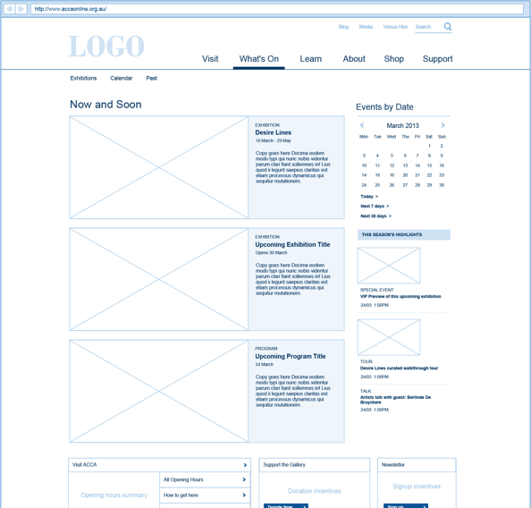
I anticipated the designs taking longer to approve than the project had allowed, so I did things a little differently. I rapidly prototyped ten different designs for the homepage, each one containing variation in colour, type and tone. Doing this gave me insight into the preferences of each stakeholder, and allowed me to move forward with the design.

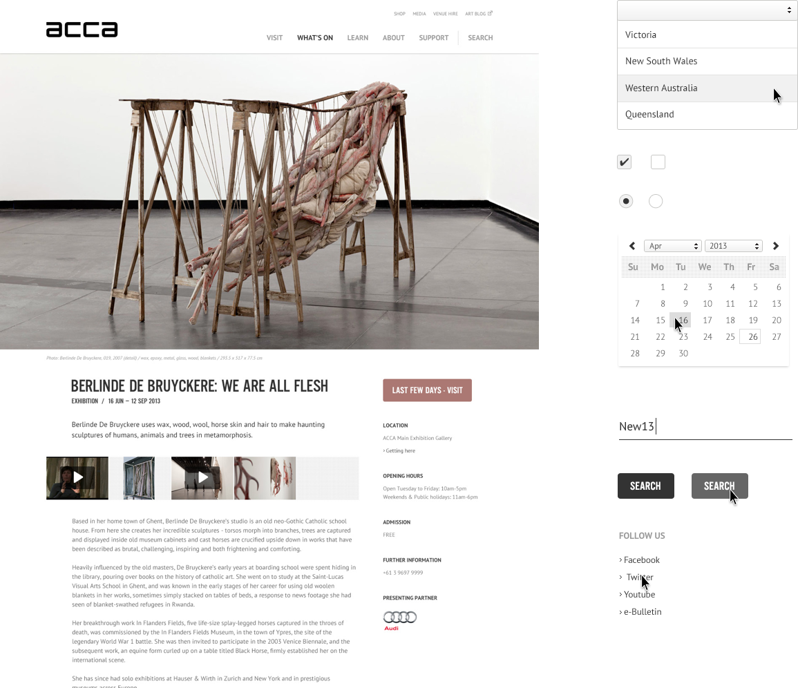
Rapid prototyping several different designs helped get to the final Exhibition pages quicker.
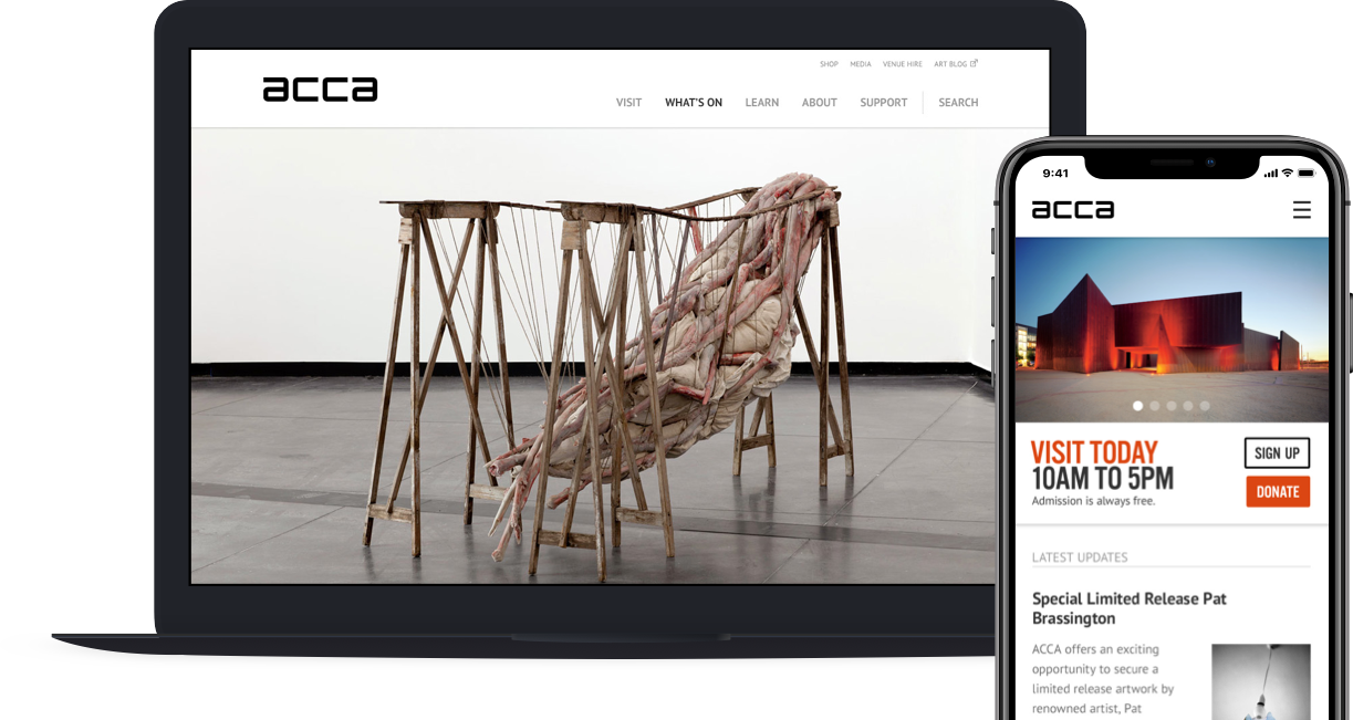
A challenge in displaying artwork on the site was the variation in image size. It was important that artists’ work wasn’t distorted to fit a fixed dimension. To achieve this I used a masonry-style layout where images could flow naturally in their contrasting sizes.
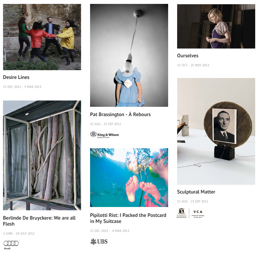
The result was a clean canvas that allowed the artwork to speak for itself, in a project that was launched on time and on budget – leading to happy stakeholders.
Artwork in the final design sat upon a contemporary yet simple & clean blank canvas.